The Beveridge Curve: Reading the Labor Market’s Hidden Message - Part 1
Written by Arbitrage • 2025-12-10 00:00:00
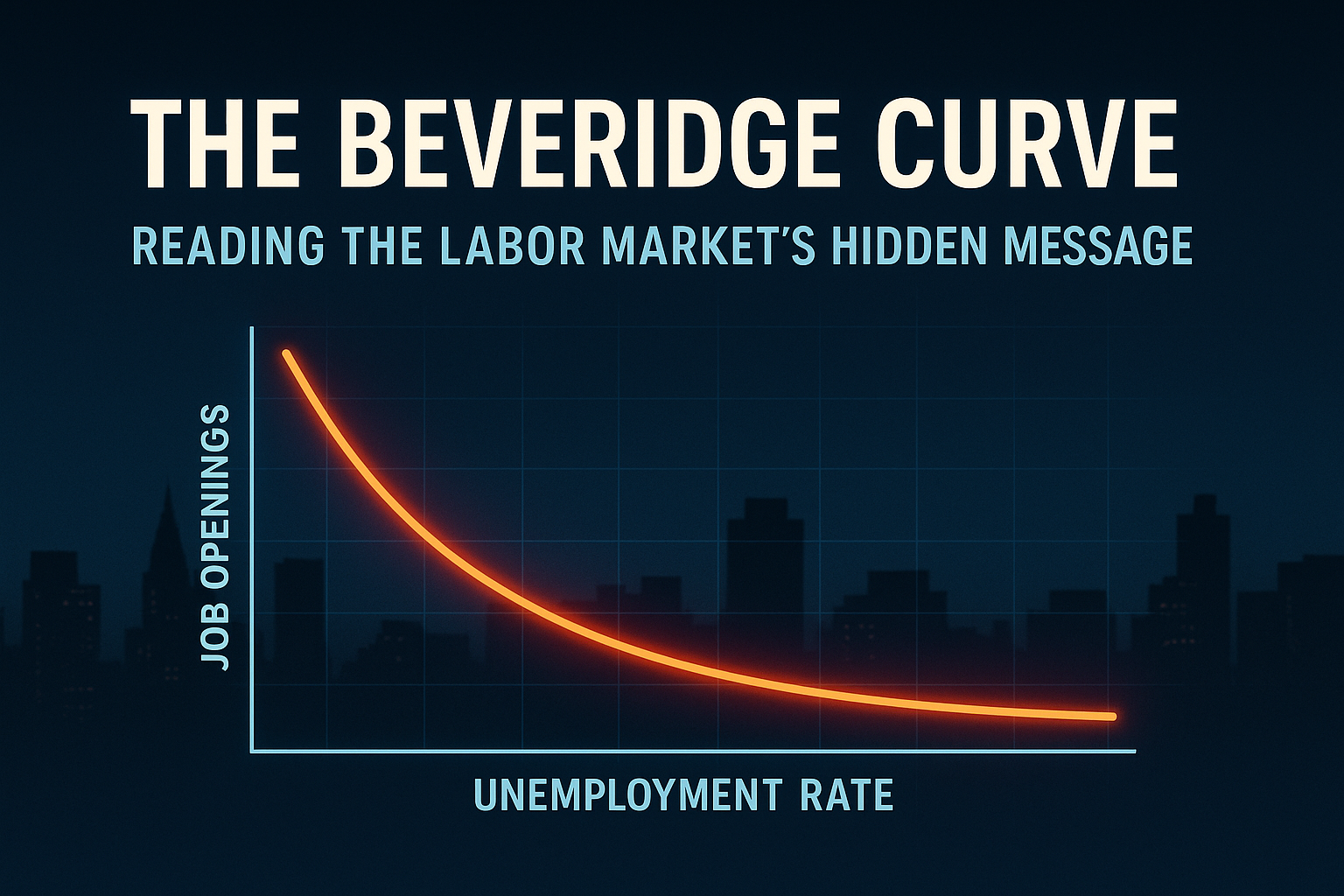
What is the Beveridge Curve? If you strip it down, the Beveridge Curve is just a scatter plot with a very opinionated story. On the horizontal axis, you have the unemployment rate. On the vertical axis, you have the job vacancy rate. In the US, this usually comes from JOLTS job openings as a share of the labor force. Plot those two every month and connect the dots. In a fairly normal economy, you get a downward-sloping curve:
- When the economy is weak, unemployment is high, and vacancies are low.
- When the economy is strong, unemployment is low, and vacancies are high.
The curve is named after William Beveridge, who argued in the 1940s that unemployment mainly reflects demand for workers. Later economists turned his idea into a visual tool by charting unemployment and vacancies together.
The Key Intuition
The Beveridge Curve is a snapshot of how well workers and jobs are being matched. If the labor market is efficient, each level of vacancies corresponds to a relatively low level of unemployment. If the match is bad, you can have a lot of people looking for work and a lot of open jobs at the same time.
That "efficiency" dimension is what makes the curve interesting. It is not just about how hot or cold the economy is. It is about how well the plumbing of the labor market is working.
Why It Matters
Most people, including a lot of financial media, still obsess over one number: the unemployment rate. The Beveridge Curve tells you more, because it captures both labor demand (how many jobs firms are trying to fill) and labor supply and matching (how many people are looking, and how quickly they get placed). That matters for a few reasons.
Tightness vs Slack: Economists talk about labor market tightness as the ratio of vacancies to unemployment. On the Beveridge Curve, a point with low unemployment and high vacancies signals a very tight market while a point with high unemployment and low vacancies signals serious slack. So the curve gives you a more nuanced read than "unemployment is 4.x percent, therefore everything is fine."
Matching Efficiency: Movements behave in two broad ways:
- Moving along the curve mostly reflects the business cycle. In a recession, vacancies fall and unemployment rises. During expansion, vacancies rise and unemployment falls.
- Shifts of the entire curve reflect changes in matching efficiency and structure. During an outward/rightward shift, for any given vacancy rate, unemployment is higher. The system has become less efficient at matching people to jobs. For an inward/leftward shift, the same vacancies are associated with lower unemployment, so matching has improved.
To central banks, that efficiency piece is key. A tight but efficient labor market behaves very differently for wages and inflation than a tight but dysfunctional one.
Inflation, Margins, and Markets: For macro and markets, the Beveridge Curve sits right between:
- Wages and inflation: Tight readings usually mean more bargaining power for workers and faster wage growth, which can feed into inflation.
- Corporate margins: Higher wages pressure margins, especially in labor-intensive sectors, even if top-line demand still looks good.
So if you trade macro, the curve is a way of asking:
- Is this "tight" labor market bullish (strong demand) or dangerous (wage spiral and margin squeeze)?
- If vacancies normalize, will unemployment explode higher, or will we glide into a soft landing with only modest job losses?
A Short History of the Curve
You do not need the full PhD history, but there are a few regimes worth knowing.
Postwar to pre-GFC: the textbook era
In the decades after World War II, the Beveridge Curve behaved largely as the textbooks promised:
- Recessions moved the economy up and to the right: higher unemployment, fewer vacancies.
- Recoveries moved it down and to the left: unemployment fell, vacancies rose.
Movements were mostly along a relatively stable curve. That suggested the matching technology of the labor market was not changing dramatically.
After the Great Financial Crisis: outward shift
The 2008-2009 crisis broke that neat picture. In the US, after the GFC the Beveridge Curve appeared to shift outward:
- For the same vacancy rate, unemployment was higher than in earlier decades.
- This was interpreted as a sign of lower matching efficiency and more structural unemployment.
Economists pointed to long-term unemployment scarring, workers whose skills no longer fit available jobs, and geographic and sectoral mismatches. Over time, as the recovery continued, the curve inched back inward, which looked like gradual healing of those structural issues.
COVID and the Great Reopening: shift on steroids
Then COVID hit. The initial shock was chaotic enough that many researchers simply drop the first months of the pandemic from their charts. Once the reopening started, job openings exploded and unemployment fell fast, but the combination of the two put the US far outside its historical Beveridge Curve.
You had very high vacancies, unemployment back near low levels, and participation still depressed. That outward shift set up the current debate: do we have a uniquely dysfunctional labor market, or just a messy adjustment to a big shock?
Come back tomorrow for Part 2 of this topic!