The Beveridge Curve: Reading the Labor Market’s Hidden Message - Part 2
Written by Arbitrage • 2025-12-11 00:00:00
If you have not read yesterday's blog post, please read it before continuing here.
Where We Are Today
Fast forward to 2024-2025, and the picture has evolved again. Vacancies are drifting down, and unemployment is barely budging. In the US, since the peak of the post-COVID hiring frenzy, job vacancies have been trending lower, but unemployment has risen only modestly. That shows up in the data as a kind of "kink" in the Beveridge Curve:
- Employers have been able to cut back on job postings for several years with relatively little damage to workers so far.
- Economists warn that if vacancies fall much further, the historical pattern implies unemployment could start rising quickly rather than smoothly.
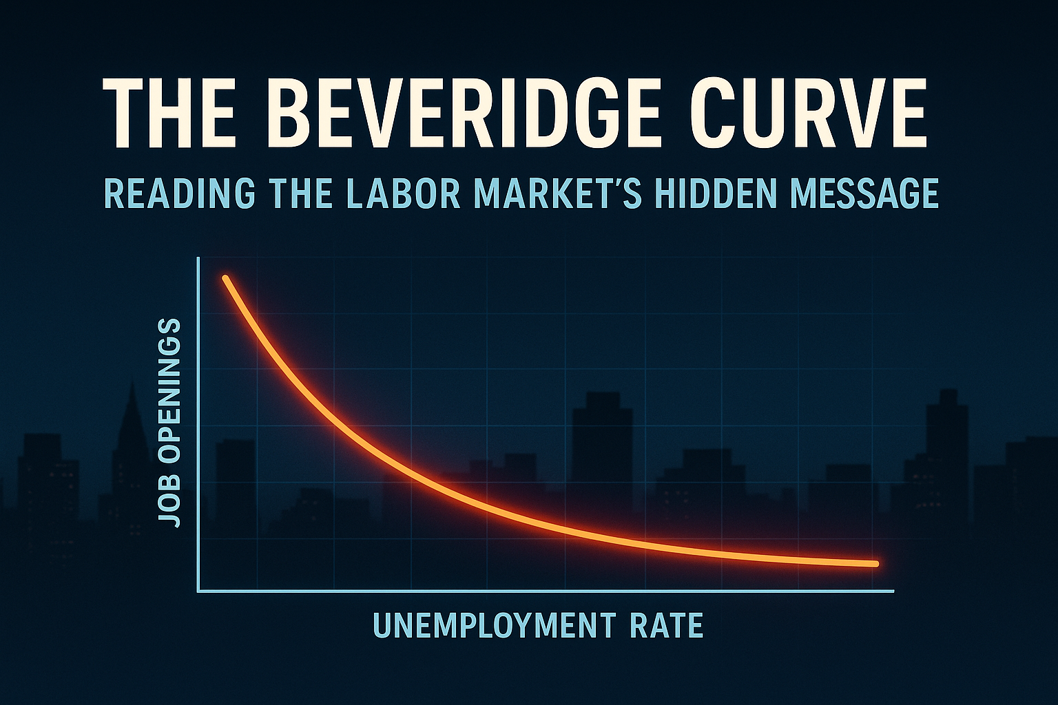
This is exactly the dynamic that has some Fed-watchers nervous. The relationship looks nonlinear. At high vacancy rates, you can cut openings without huge unemployment fallout. Once you cross a certain threshold, further vacancy cuts historically come with sharp jumps in unemployment. That helps explain why the Federal Reserve is extremely sensitive to emerging weakness in job openings, even while inflation is still above target and financial conditions look loose.
Is the post-pandemic curve still shifted out? Broadly, yes. Most analyses still find that for any given unemployment rate, vacancy rates remain higher than in the 2000s. That points to a labor market that is less efficient than it used to be at matching people to roles. Why might that be?
Mismatch
- Sector shifts: some industries shrank while others grew after COVID.
- Geography: housing constraints and remote work preferences make workers less mobile.
Participation and Demographics
- Retirements that are not being reversed.
- Health issues and caregiving keep people out of the labor force.
Preferences and Job Design
- Workers care more about schedule, flexibility, and location.
- Some posted jobs are unattractive at the offered wage or conditions.
Data Quirks and "Ghost Vacancies"
- Some firms keep postings up to build pipelines, even when they are not urgently hiring.
- That can exaggerate the vacancy side of the curve.
If you zoom out to Europe or other advanced economies, you see similar patterns in their Beveridge Curves: outward shifts and more complex dynamics post-pandemic, although the timing and magnitude vary by country.
So what is the hidden message right now? Putting it together, the labor market is no longer in the emergency post-COVID state, but the Beveridge Curve has not fully returned to its pre-2020 shape. The current region of the curve looks like a potential tipping point, where further vacancy declines could translate into a sharper rise in unemployment than casual observers expect.
For macro and markets, that suggests soft-landing scenarios rely heavily on reducing vacancies without causing a large rise in unemployment. If that nonlinear kink in the curve asserts itself, the landing may be rougher and faster, with consequences for risk assets and policy rates.
Conclusion: Watching the Curve Behind the Headlines
If there is one takeaway, it is this: the unemployment rate by itself is a noisy headline. The Beveridge Curve is the subtitles that explain what is really going on. When you track both unemployment and vacancies, and watch how the whole curve behaves, you get answers to questions that matter for investors and policymakers:
- Is the labor market tight in a healthy way, or tight because the matching mechanism is broken?
- Are we gliding down the curve as demand cools, or is the entire curve shifting in a way that points to structural damage?
- Are we in the "safe" region where vacancies can fall without much job loss, or approaching the kink where small changes in postings trigger big jumps in unemployment?
The current message from the Beveridge Curve is subtle but important. We are past the wildest distortions of the pandemic, we are still living with an outward-shifted, less efficient labor market, and we might be close to a point where seemingly minor vacancy declines can change the story on jobs very quickly.
For your own macro playbook, that means treating vacancy and unemployment data not as separate time series, but as a pair that trace out the path of the curve over time. The shape of that path, and especially any sharp turns, often matters more than the latest single unemployment print.